
Simplifying the patient queue for medical providers
🖼️ Background
Healiom leverages technology to make the healthcare experience easier and more accessible through AI integration, remote care, and improved task efficiency.
Doctors are often overworked and underpaid, caused largely by a mismatch between provider availability and patient needs. Providers often see dozens of patients a day, and it quickly gets difficult to understand who demands their attention first. This leads to a lack of prioritization and increased exertion of mental bandwidth that could have been used to help more patients. So how might we enable providers to make better, quicker decisions regarding patient care?
💡 Hypothesis
The Care Queue provides doctors with a way to understand the queue of patients and their needs at a glance. We hypothesized that this would increase efficiency and empower them to make better decisions based on patients' needs.
🩺 Understanding provider frustrations
Through in-depth conversations with our team's Chief Medical Officer and ER doctor, Sean Howse, I had gained a clearer understanding of the shortcomings of current electronic health systems (EHRs). The key issues include:
confusing visual displays
too many clicks to find information
data overload
All of these issues contribute to physician frustrations and errors that could lead to inefficiency or patient harm. With these pain points in mind, I set out to design the Care Queue's features in a way that would make finding and understanding information easy.
🔑 Key features
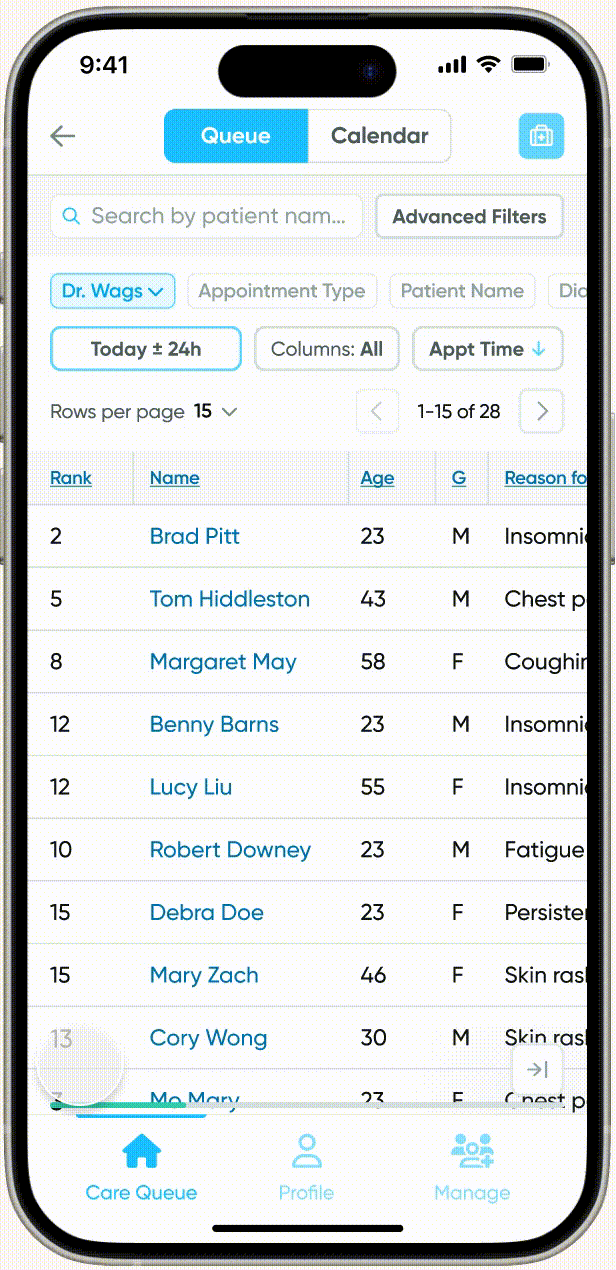
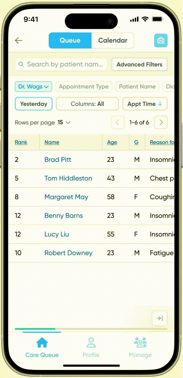
Time frame customization
To ensure that the user is not overwhelmed by a huge number of patients and their respective data, we allow them to choose the time frame that they'd like to focus on. We account for 3 common use cases: viewing today's schedule for a quick snapshot of their day, checking in on the status of patients they saw yesterday, and viewing tomorrow's schedule to understand their upcoming workload. With this in mind, we present the user with the option to view today, yesterday, tomorrow, or all three.
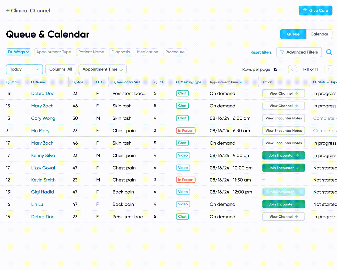
Sorting
A provider may want to sort their upcoming patients by their Emergency Severity Index (ESI) to prioritize patients who are facing more severe or urgent issues. Or they may want to prioritize patients with a longer length of stay (LOS) to ensure that they are discharged more quickly. In order to provide doctors with the flexibility to use the Care Queue according to their preferences, we provide the ability to sort the patients in their Care Queue by a variety of factors.

Flexible search and filters
Users have the option to narrow down their results through searchable characteristics and/or filters. Filters that are predicted to be used frequently such as 'Department' and 'Appointment type' are presented through easily-accessible quick filters at the top of the Care Queue while other filters can be found under 'Advanced Filters'. Users may easily perform a search within a specific criteria by clicking in to the column name . We also offer the option to perform a more general search to prevent the inconvenience of scrolling horizontally to the correct column.

Example use of quick filters.
💢 Preventing scrolling fatigue
Due to the nature of the data that we are presenting to the user, the table of patient information contains many columns, forcing the user to scroll horizontally to find information. This becomes an issue, especially for smaller screen sizes where only a few columns are visible at once. To address this, I came up with three methods to make navigating the columns easier.
Fixed columns and information prioritization
Patient Name serves as the primary identifier, and Rank represents the calculated urgency of an appointment or patient. These columns and their values stay pinned to the left side of the screen. This ensures that the user always has relevant context for the information that they are viewing as they scroll.
Jumping
Horizontal scrolling through dragging can cause the user to have difficulty landing exactly on the column they need because it is difficult to gauge how far they must swipe. To provide an alternate way to navigate the columns, there are buttons at the bottom of the screen that allow the user to jump a few columns to the right or left. Through continued use of this feature, the user may eventually intuitively know how many taps away a particular column is.
Column categories
Users may select a category of columns to view depending on their needs. A provider who is checking on the status of a patient they saw yesterday is only interested in information in the 'Operational' category, which includes Location, Status/Disposition, Length of Stay (LOS), Labs, Imaging, and Scripts. By selecting the appropriate category, the number of columns is reduced from 20 to 8, narrowing down the amount of information that's presented to them and reducing the amount of horizontal scrolling to find the column(s) they need.
⛳ Where we are today
Following conversations with the Engineering team to ensure feasibility, we are now in the early stages of development for the Care Queue.
Keeping in mind the same discoveries that were established during the design of the Care Queue, I am now designing the Care Calendar. Used in conjunction, the Care Queue and Care Calendar will provide doctors with the ability to view their appointments, patients, and overall schedules from multiple lenses, empowering them to make informed, efficient decisions.
In the future, I'd like to observe the way providers use our product to gain a better understanding of the main use cases and how we can continue to refine the design to make their primary tasks easier.